
Power calculation in statistical test
Published:
The goal of employing power is strategic. We want to give ourselves the greatest chance of successfully rejecting the null hypothesis, assuming it is incorrect. Understanding power is essential for statisticians in planning how and what data to collect to extract useful knowledge.
The Hypotheses, the Errors, and the Definition of Power
At the heart of Null Hypothesis Significance Testing (NHST) are the null and alternative hypotheses, which are mutually exclusive statements about the world. For example, in a two-sample T-test, the null hypothesis (H₀) states there is no difference in population means, while a two-sided alternative hypothesis (Hₐ) states that there is a difference.
To understand power, we must first revisit the two types of errors inherent in statistical decision-making:
Type I Error (α):
This occurs when we reject the null hypothesis when it is actually true. It is the error we condition on H₀ being true.
We define our maximum tolerance for this error (the level, e.g., 5%) to create the critical region.
A Type I error is metaphorically seeing an illusion that’s not there.Type II Error (β):
This occurs when we fail to reject the null hypothesis even when the alternative hypothesis is true.
This error conditions on the fact that Hₐ is true. A Type II error is considered a missed opportunity.
We typically do not discuss hypothesis tests in terms of Type II error (β). Instead, we use its converse: Power.
Power is defined as:
\[\text{Power} = 1 - \beta\]It represents the probability of rejecting the null hypothesis given that the alternative is true.
When the alternative is true, rejecting the null is the correct decision—and it’s what we want.
Visualizing Power: The Two Distributions
Understanding power often involves visualizing two probability distributions simultaneously. This visualization requires us to set up a specific context:
The Context:
We compare two groups—a control/placebo group (μ₍C₎) and a treatment group (μ₍WT₎)—in a two-sample problem with a continuous outcome like blood pressure.
We assume the groups have equal, known variance and a large enough sample size for the Central Limit Theorem to apply. The test statistic we use is the raw difference in sample means.The Null Distribution:
If the null hypothesis (H₀) is true (i.e., there is no difference), the distribution of the test statistic is centered at zero.The Alternative Distribution:
To talk about power properly, the alternative hypothesis must be specified by a concrete value, often called Delta (Δ).
If this specific alternative is true, the distribution of the test statistic is centered at Δ.
The process begins by using the chosen Type I error tolerance (level, α) to define critical values based on the null distribution.
These critical values determine the critical region.
When we switch our perspective to the alternative distribution (centered at Δ), the critical value remains the same because it originates from the null distribution.
The area under the alternative distribution that falls within this critical region represents power.
The remaining area under the alternative distribution (where we fail to reject H₀) represents the Type II error.
# Visualizing Null and Alternative Distributions
set.seed(123)
library(ggplot2)

alpha <- 0.05
mu_null <- 0
mu_alt <- 2
sd <- 3

# Define critical value from null distribution
crit_val <- qnorm(1 - alpha/2, mean = mu_null, sd = sd)

x <- seq(-10, 10, 0.1)
df <- data.frame(
  x = x,
  null = dnorm(x, mean = mu_null, sd = sd),
  alt  = dnorm(x, mean = mu_alt, sd = sd)
)

ggplot(df, aes(x)) +
  geom_line(aes(y = null), color = "blue", size = 1.2) +
  geom_line(aes(y = alt), color = "red", size = 1.2) +
  geom_vline(xintercept = c(-crit_val, crit_val), linetype = "dashed") +
  annotate("text", x = crit_val + 0.5, y = 0.05, label = "Critical value", color = "black") +
  labs(title = "Visualizing Null vs Alternative Distributions",
       y = "Density", x = "Test Statistic") +
  theme_minimal()
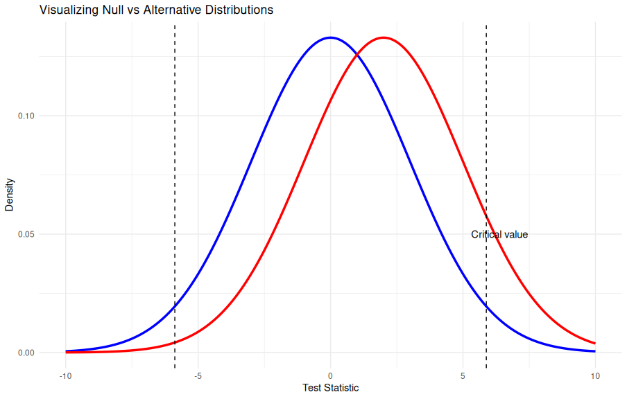
This plot shows the null (blue) and alternative (red) distributions.
The dashed lines mark the critical region for α = 0.05.
The red area beyond the critical value represents power, while the area left behind represents Type II error (β).
The Factors That Control Power
Four main factors control the magnitude of statistical power in an experiment:
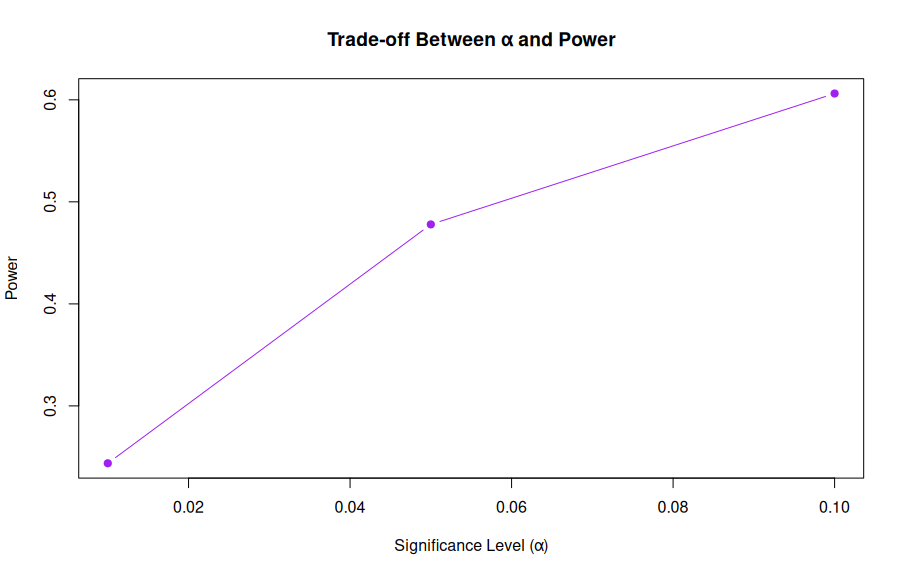
1. The Level (α)
The level is our maximum tolerance for a Type I error. There is a fundamental trade-off between Type I error control and power.
- If we choose a stricter level (e.g., reducing α from 5% to 1%), the new critical values become more extreme.
- While this reduces the probability of a Type I error, it simultaneously slightly reduces the critical region from the perspective of the alternative distribution, thus reducing power. ```r library(pwr)
Vary alpha
alpha_values <- c(0.1, 0.05, 0.01) power_values <- sapply(alpha_values, function(a) { pwr.t.test(d = 0.5, n = 30, sig.level = a, type = “two.sample”, alternative = “two.sided”)$power })
data.frame(alpha = alpha_values, power = round(power_values, 3)) plot(alpha_values, power_values, type = “b”, pch = 19, col = “purple”, xlab = “Significance Level (α)”, ylab = “Power”, main = “Trade-off Between α and Power”)
---
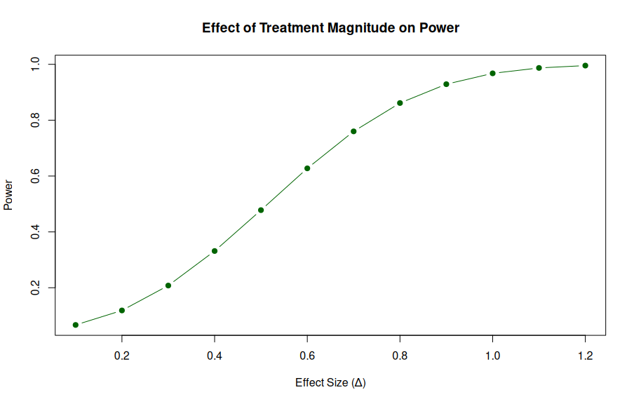
### 2. The Specific Alternative Hypothesis (The Treatment Effect, Δ)
The specific difference in population means (Δ) represents the treatment effect. Since Δ dictates the center of the alternative distribution, it directly influences power.
- **Small Treatment Effects:**
If Δ is small, the alternative distribution is not much different from the null distribution. This leads to a smaller critical region under Hₐ and lower power. It is hard to detect small but significant effects.
- **Large Treatment Effects:**
If Δ is large, the alternative distribution is far from the null. Most of the distribution falls past the critical value, leading to higher power.
If the effect is large enough, you can achieve essentially 100% power.
```r
effect_sizes <- seq(0.1, 1.2, 0.1)
power_effect <- sapply(effect_sizes, function(d) {
pwr.t.test(d = d, n = 30, sig.level = 0.05, type = "two.sample")$power
})
plot(effect_sizes, power_effect, type = "b", pch = 19, col = "darkgreen",
xlab = "Effect Size (Δ)", ylab = "Power",
main = "Effect of Treatment Magnitude on Power")
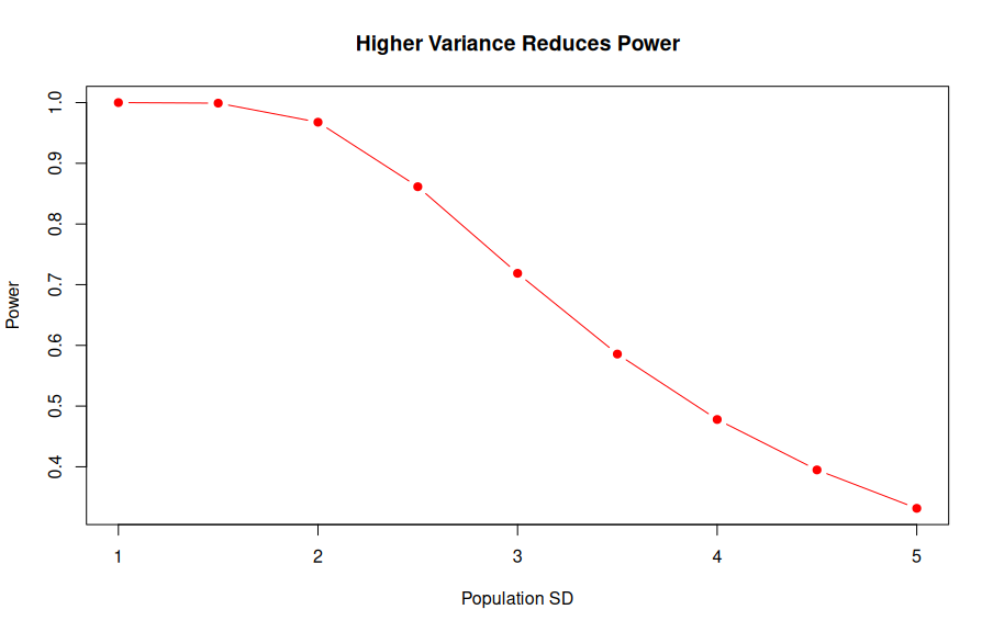
3. Population Variance
The variance of the test statistic is governed by both the population variance and the sample size.
A larger population variance spreads out both the null and alternative distributions.
- A larger variance tends to be a net negative for power, though the visual effect is complex because the critical value shifts while the distribution spreads.
Importantly, we cannot control the population variance itself.
sd_values <- seq(1, 5, 0.5)
effect_size <- 2
n <- 30

power_var <- sapply(sd_values, function(sd) {
  d <- effect_size / sd
  pwr.t.test(d = d, n = n, sig.level = 0.05, type = "two.sample")$power
})

plot(sd_values, power_var, type = "b", pch = 19, col = "red",
     xlab = "Population SD", ylab = "Power",
     main = "Higher Variance Reduces Power")
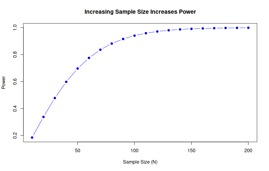
4. Sample Size (N)
This is the main thing we can control to increase our chance of rejecting the null hypothesis.
- Since the sample size (N) is in the denominator of the variance calculation, increasing N decreases the overall variance of the sampling distribution.
- Visually, as N increases, both the null and alternative distributions get narrower.
- This concentration around the true Delta means that the alternative distribution concentrates around the true difference, increasing the size of the critical region and, by extension, increasing power.
The process of figuring out the sample size that will provide a particular level of power is called a sample size calculation.
n_values <- seq(10, 200, 10)
power_n <- sapply(n_values, function(n) {
  pwr.t.test(d = 0.5, n = n, sig.level = 0.05, type = "two.sample")$power
})

plot(n_values, power_n, type = "b", pch = 19, col = "blue",
     xlab = "Sample Size (N)", ylab = "Power",
     main = "Increasing Sample Size Increases Power")
 —
—
Conclusion
Power and sample size calculations are fundamental tools for planning. Statisticians utilize these concepts to create strategic, motivated plans for experiments.
We seek to maximize our ability to detect a true treatment effect while ensuring we guard against making incorrect decisions (Type I errors).
While a plan can be as solid as possible at the outset, ultimately, every experiment is at the mercy of randomness.
However, going into an experiment with a statistically motivated plan is always superior to proceeding without one.